“It’s new, it’s fresh, it’s bright”: Patagonia’s colour designer on the mood of spring 2026
The brand just revealed its spring palette and it’s all about optimism and wearability

Get all the latest news, reviews, deals and buying guides on gorgeous tech, home and active products from the T3 experts
You are now subscribed
Your newsletter sign-up was successful
Patagonia is leaning into optimism for Spring 2026, and according to colour designer Anna Maravelli, the brief was refreshingly simple: imagine a world that feels more abundant, not dystopian.
“Our inspiration for this season was imagining a brighter future, more lush and abundant than kind of your classic apocalyptic future,” she explains in the brand’s latest behind-the-scenes video.
Shop Patagonia's up to 50% off sale
Article continues belowSpring, she says, is the most playful time to work in colour. “It’s new, it’s fresh, it’s bright… you just have to keep your eyes open and always be a sponge to it.”
The result is a trio of standout hues that balance vibrancy with wearability. Below, we break down each shade and the types of Patagonia pieces they work best in.
Aqua Stone
Aqua Stone is the headline shade of the collection: a saturated blue-green that instantly signals spring without veering into neon territory. Maravelli describes it as “super bright and lush,” rooted in the season’s broader theme of abundance.
In practice, this is the kind of colour Patagonia tends to deploy on lightweight shells, trail shorts and everyday fleece jackets, pieces where a pop of colour adds energy without overwhelming the look.
Get all the latest news, reviews, deals and buying guides on gorgeous tech, home and active products from the T3 experts
If you’re colour-curious but cautious, Aqua Stone works best as a single statement item paired with neutrals like black, navy or khaki.
It’s particularly effective in technical fabrics, where the sheen of recycled nylons and polyesters makes the tone feel even more vivid outdoors.
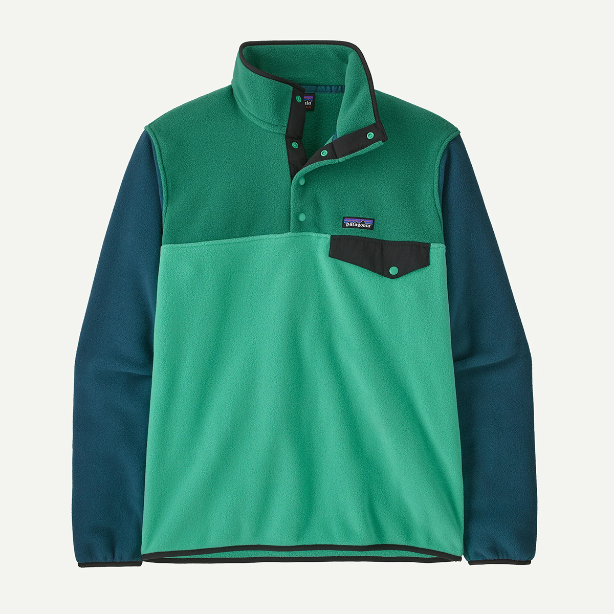
A Patagonia icon that blends retro style with everyday practicality, the Lightweight Synchilla Snap-T is made from soft recycled polyester fleece that delivers warmth without bulk. The relaxed fit layers easily over tees or under shells, making it a dependable grab-and-go piece for cool mornings, travel days and post-adventure downtime.
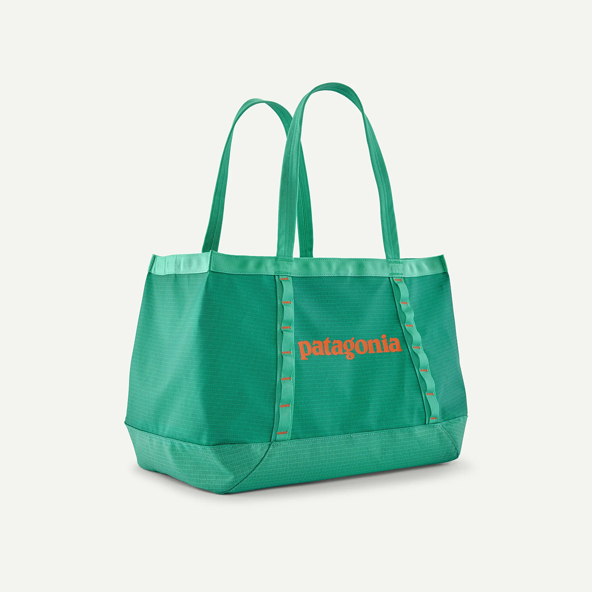
Built from the same tough recycled fabric as Patagonia’s legendary duffels, the Black Hole Tote 25L is a do-everything hauler. It’s spacious enough for gym gear or groceries, structured enough to stand upright, and durable enough to shrug off daily abuse; a simple, versatile bag you’ll reach for constantly.
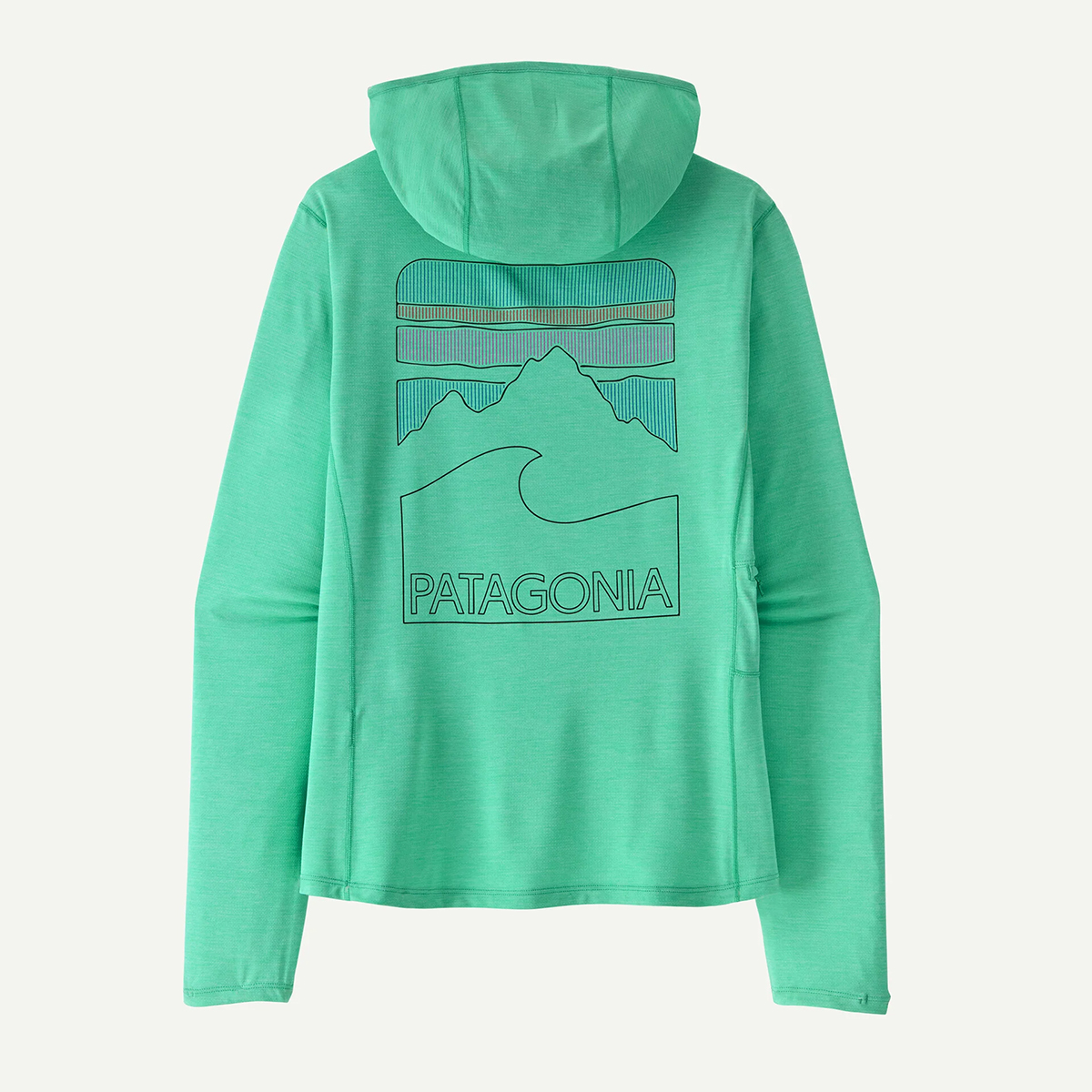
Designed for long days under open skies, this lightweight technical hoody combines UPF sun protection with Patagonia’s breathable Capilene Cool fabric. It wicks moisture, dries quickly and feels airy against the skin, while the Peak Visions graphic adds a subtle hit of personality to an otherwise performance-focused layer.
Weathered Stone
If Aqua Stone is the mood-lifter, Weathered Stone is the wardrobe anchor. Maravelli calls it “a really nice garden neutral” with a “meditative stone tone,” and it’s easy to see why this shade will resonate with Patagonia’s core audience.
Soft, earthy and quietly versatile, it slots seamlessly into the brand’s heritage palette of sands, olives and browns. You can see it across insulating layers, canvas-style pants and lifestyle outerwear. Pieces designed to transition from trail to town.
The beauty of Weathered Stone is its longevity. It won’t date quickly, and it pairs effortlessly with brighter seasonal colours, making it the most practical entry point into the new palette.
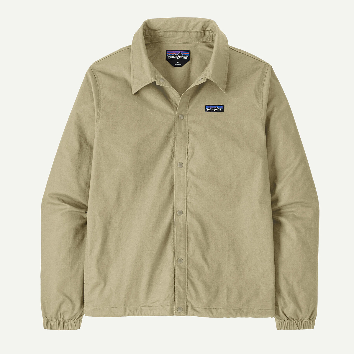
A minimalist layer built for everyday versatility, the Lightweight All-Wear Unlined Jacket combines a clean, workwear-inspired silhouette with breathable organic cotton fabric. It’s light enough for transitional weather yet structured enough to elevate casual outfits, making it an easy throw-on piece for commuting, travel and relaxed outdoor adventures.
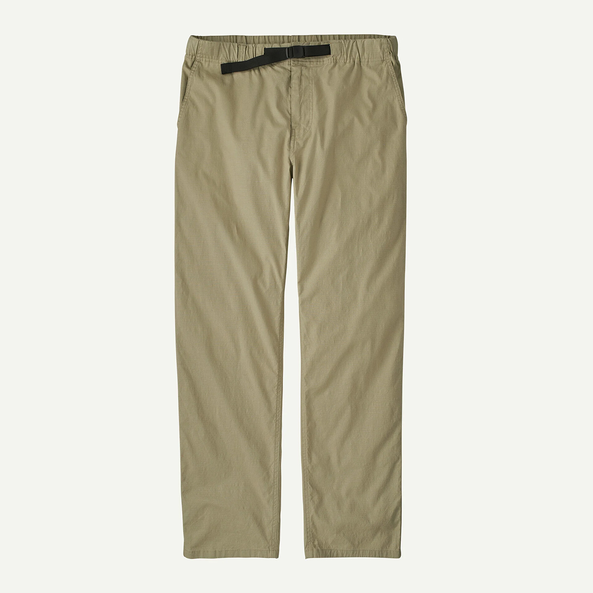
Taking cues from classic martial arts trousers, the Lightweight All-Wear Gi Pants prioritise comfort and mobility with a relaxed fit and soft organic cotton construction. Durable yet easygoing, they’re designed for everything from weekend errands to low-key hikes, delivering a laid-back look that still feels purpose-built.
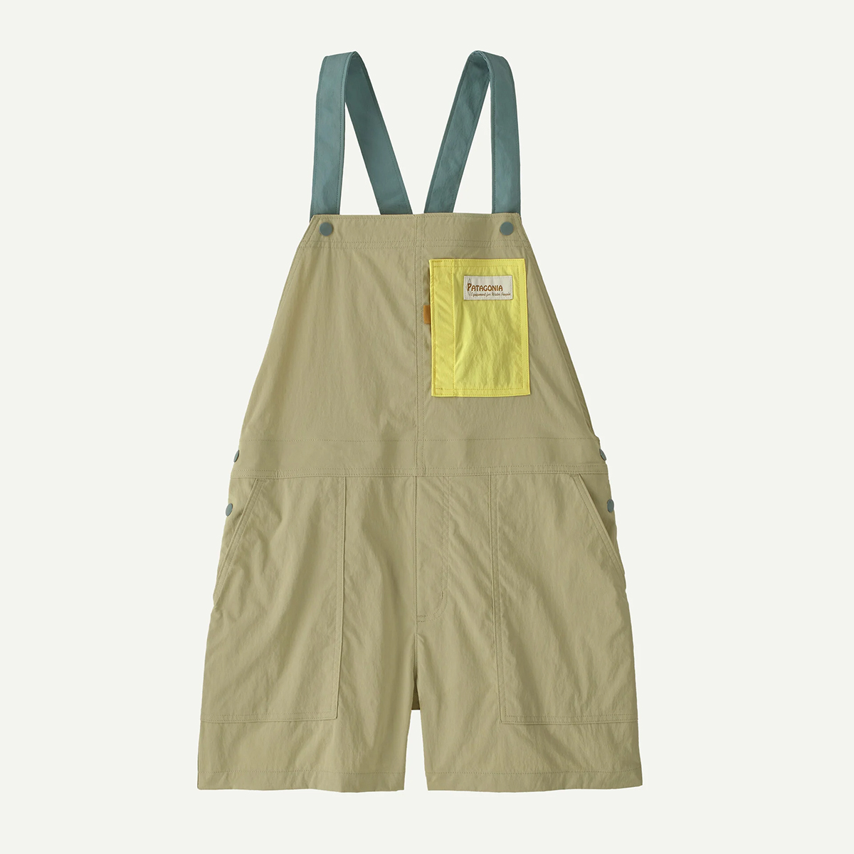
Built for movement but styled for daily wear, the Outdoor Everyday Overalls offer a practical one-and-done outfit with plenty of personality. Lightweight, durable fabric and adjustable straps keep them comfortable across seasons, while generous pockets and a relaxed fit make them equally at home on the trail or in town.
Blue Sage
Blue Sage sits between the other two hues, offering a calm, nature-inspired middle ground. Maravelli notes you can spot it everywhere: “You could find it in stones… in the water, on a pelican, in the sky. It’s kind of just all around you.”
That versatility translates well into Patagonia’s technical range, where Blue Sage feels understated yet distinctive. It’s particularly well-suited to active pieces where a muted tone blends better into outdoor environments than high-contrast brights.
For everyday wear, it pairs beautifully with both warm neutrals and deeper blues, making it arguably the easiest colour in the lineup to style head-to-toe.
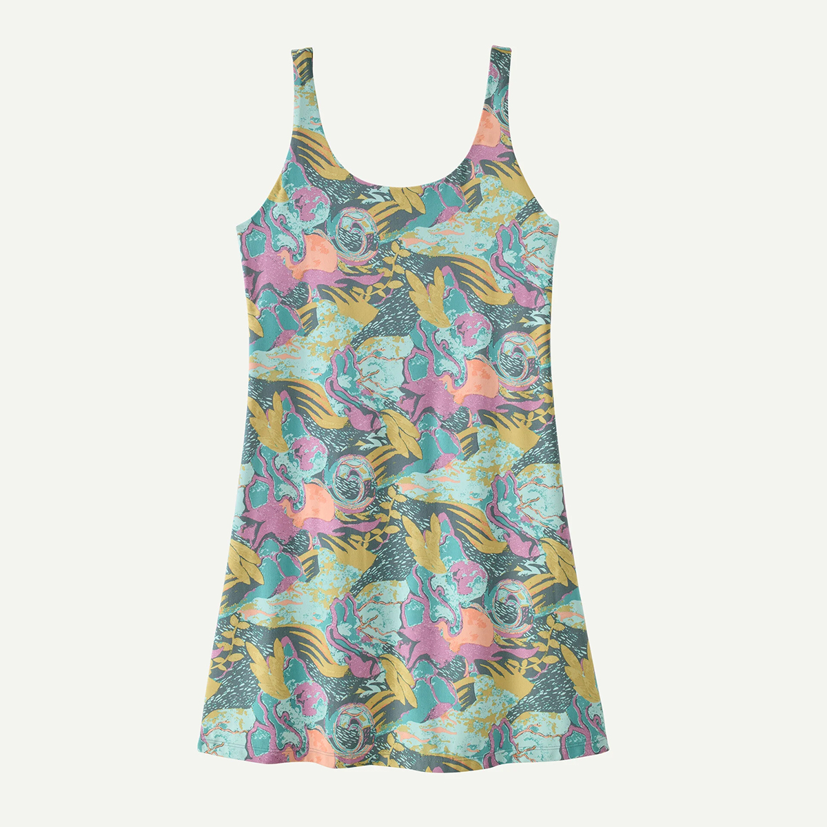
An easygoing warm-weather staple, the Maipo Dress blends soft, stretchy fabric with a flattering, movement-friendly fit. It’s breathable enough for travel and everyday wear yet polished enough for casual evenings, delivering that rare mix of comfort and versatility Patagonia does so well.
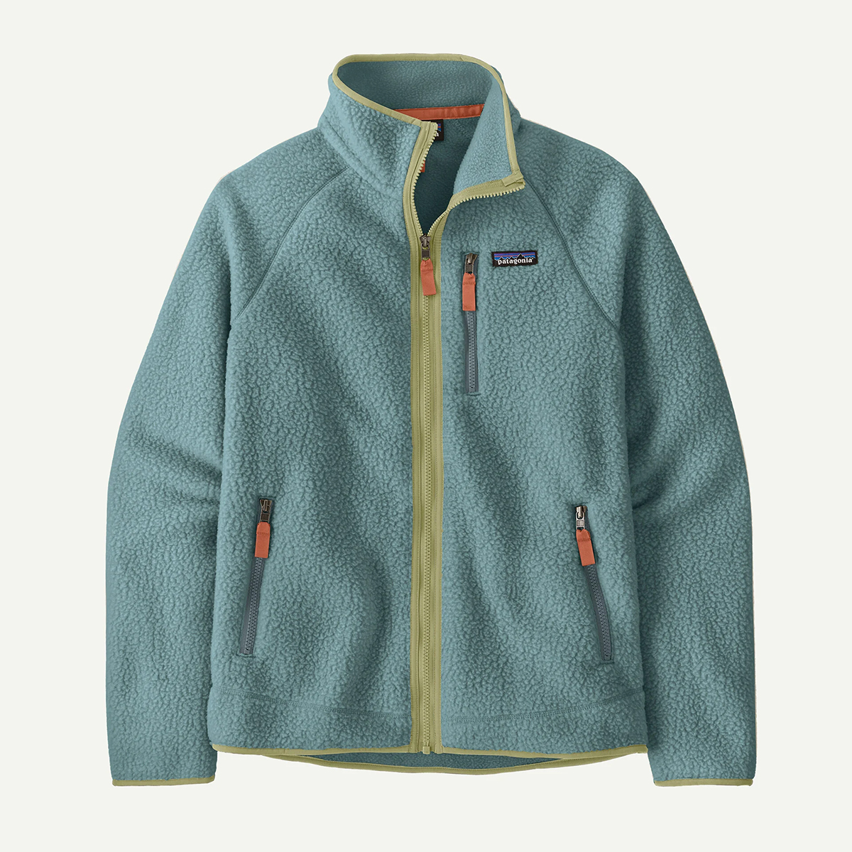
A cosy throwback with modern sustainability credentials, the Retro Pile Fleece Jacket delivers plush warmth in a classic, heritage-inspired silhouette. The deep-pile recycled fleece feels instantly comfortable, while the simple zip design makes it an ideal layering piece for chilly commutes, campsite mornings or relaxed weekends outdoors.
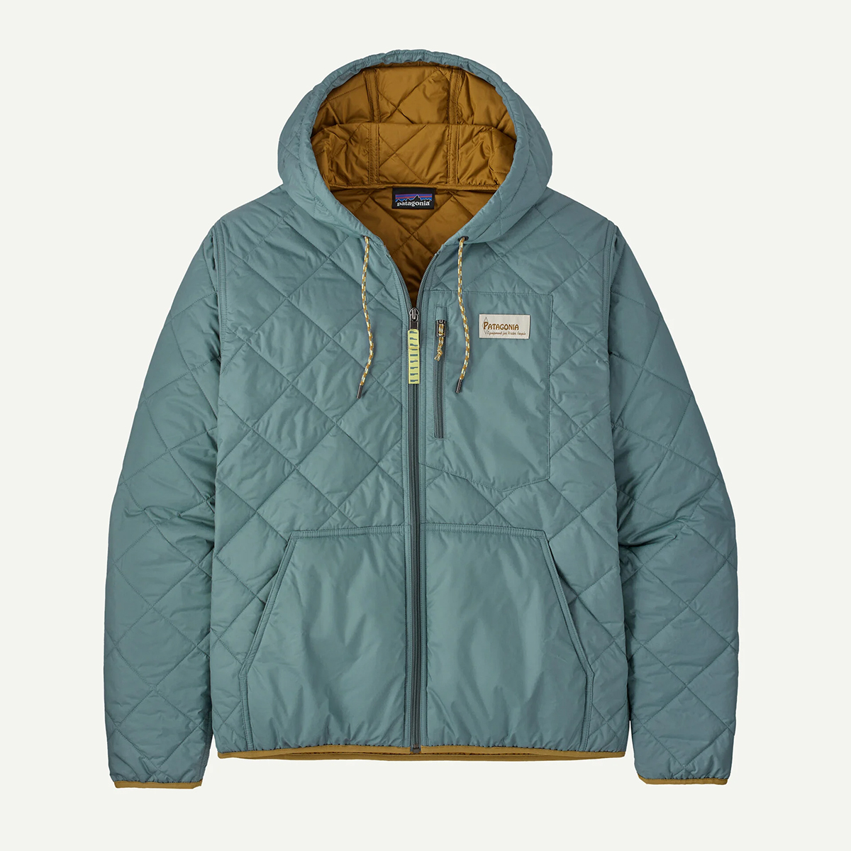
Bringing a technical edge to a timeless shape, the Diamond Quilted Bomber Hoody pairs lightweight insulation with a clean bomber profile. The quilted construction adds warmth without bulk, while the hood boosts versatility, making it a smart transitional layer for cool days in the city or evenings by the trailhead.

Matt Kollat is a journalist and content creator for T3.com and T3 Magazine, where he works as Active Editor. His areas of expertise include wearables, drones, action cameras, fitness equipment, nutrition and outdoor gear. He joined T3 in 2019.
His work has also appeared on TechRadar and Fit&Well, and he has collaborated with creators such as Garage Gym Reviews. Matt has served as a judge for multiple industry awards, including the ESSNAwards. When he isn’t running, cycling or testing new kit, he’s usually roaming the countryside with a camera or experimenting with new audio and video gear.
You must confirm your public display name before commenting
Please logout and then login again, you will then be prompted to enter your display name.