Chrome OS users are getting a cool free upgrade
Search for your files quickly and seamlessly


Get all the latest news, reviews, deals and buying guides on gorgeous tech, home and active products from the T3 experts
You are now subscribed
Your newsletter sign-up was successful
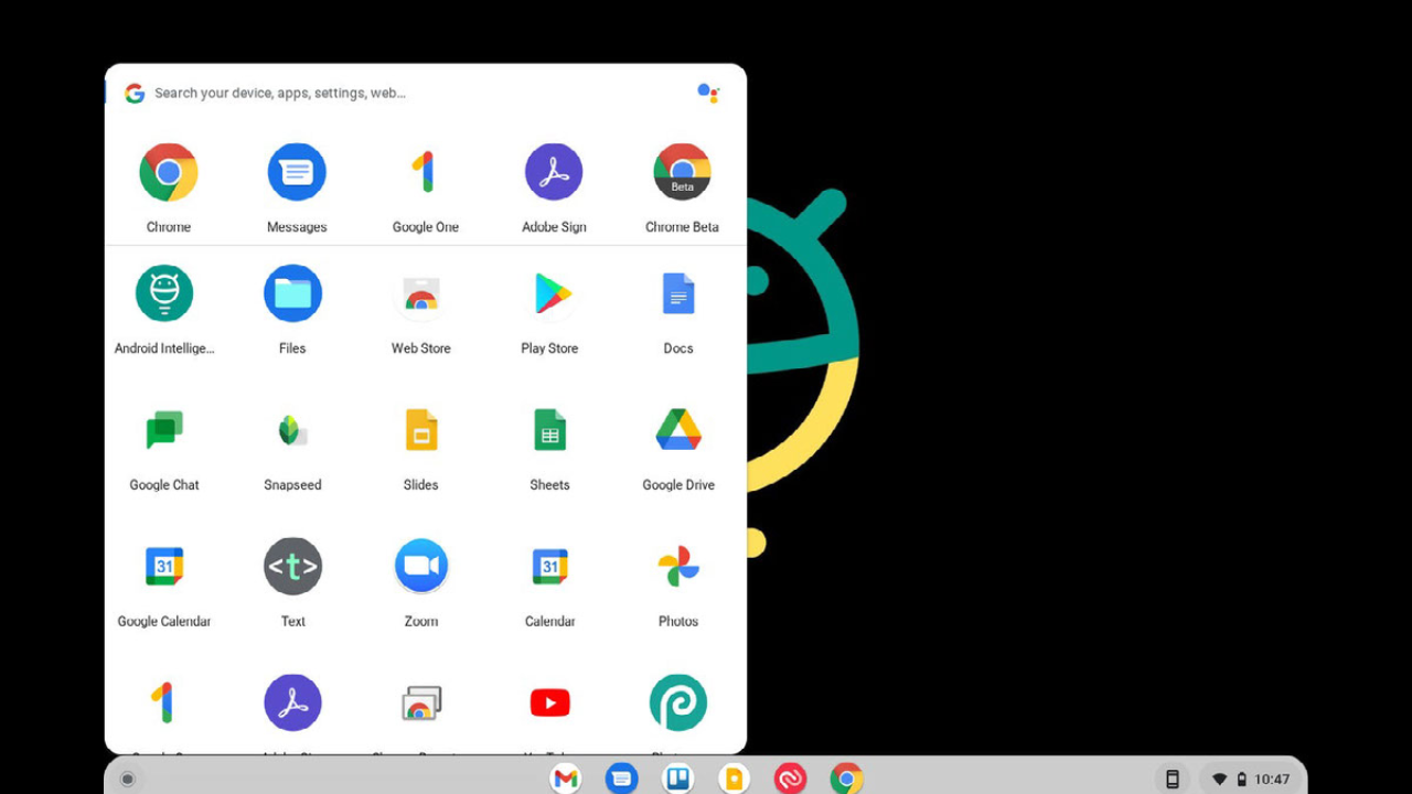
If you hadn't already guessed it, here at T3 we love a Chromebook update. That's because we're avid users of the best Chromebook computers, which are smart, responsive, and always get the job done. Google has now finally released a long-awaited update to the Chrome app launcher design, which delivers a tidier, more compact way to access your apps and web apps among other things.
Google has been tinkering away on this new launcher for a while now, but the time has finally come for regular users to enjoy the feature. And enjoy it you will: the new-look launcher organizes your apps and search results into categories to stop you from being swamped with information and subsequently unable to find anything at all.
- Chromecast with Google TV users are getting a cool free upgrade
- Sky TV, mobile and broadband customers are getting free Christmas gifts
- Android Auto users are getting a cool free upgrade
Chrome OS launcher upgrade

Computerworld Chrome OS launcher
As said, in the current launcher design info arrives by the boatload when using the traditional 'Everything button' to search through your apps, throwing out an alphabet soup of results that are neither grouped or arranged in any useful way. But thanks to Google's hard-working developers, users can now enjoy a revamped Chrome app launcher that is similar to the original Chrome OS launcher setup from days gone by. In other words, it's simpler and cleaner.
Article continues belowWhat goes around comes around, as they say, in what is an amusing turn of events that sees Google swiveling back to its older designs. Not only that, the good folks over at Computerworld note that the new Chromebook Productivity Launcher is "undeniably similar in basic structure to the Windows 10 Start menu setup." Such classic designs survive for good reason, even if becoming extinct to then once again inform new designs.
Neat and tidy
As we recently reported, searching for anything in the new Windows Start-style launcher shows results that are parsed out into “categories”. The design is more orderly and yielded results are arranged based on the result type for easier viewing and selecting. That's right: all the results are there in front of you neatly arranged on the screen, visible and searchable. What's more is that it doesn't hog screen space, using only a fraction of the screen.
There's a whole lot more to unearth in this update (including instructions on how to turn the flag on), but overall the newly-designed Chrome OS launcher interface is a really useful improvement for all users, making things far more practical when working with Chrome OS environments.
Get all the latest news, reviews, deals and buying guides on gorgeous tech, home and active products from the T3 experts

Luke is a former news writer at T3 who covered all things tech at T3. Disc golf enthusiast, keen jogger, and fond of all things outdoors (when not indoors messing around with gadgets), Luke wrote about a wide-array of subjects for T3.com, including Android Auto, WhatsApp, Sky, Virgin Media, Amazon Kindle, Windows 11, Chromebooks, iPhones and much more, too.