Google Wallet could soon look more like an iPhone
There's a new interface for Pixel owners that make payments much slicker


Get all the latest news, reviews, deals and buying guides on gorgeous tech, home and active products from the T3 experts
You are now subscribed
Your newsletter sign-up was successful
Quick Summary
A new update for Google Wallet could leave it looking more like an iPhone.
That should make it cleaner and easier to pick between payment cards on the fly.
Many of us have ditched cash and there's an increasing number of people who have ditched physical cards too, thanks to convenient payment via smartphones. Google appears to be preparing a feature for Google Wallet that's going to make payments as slick as it is on Apple Pay.
Don't get me wrong, Google Pay is great, but Apple has led the way here, offering a system that's a little better when it comes to actually paying for something with the iPhone. That comes down to a simple part of the user interface, which is where Google is making a change.
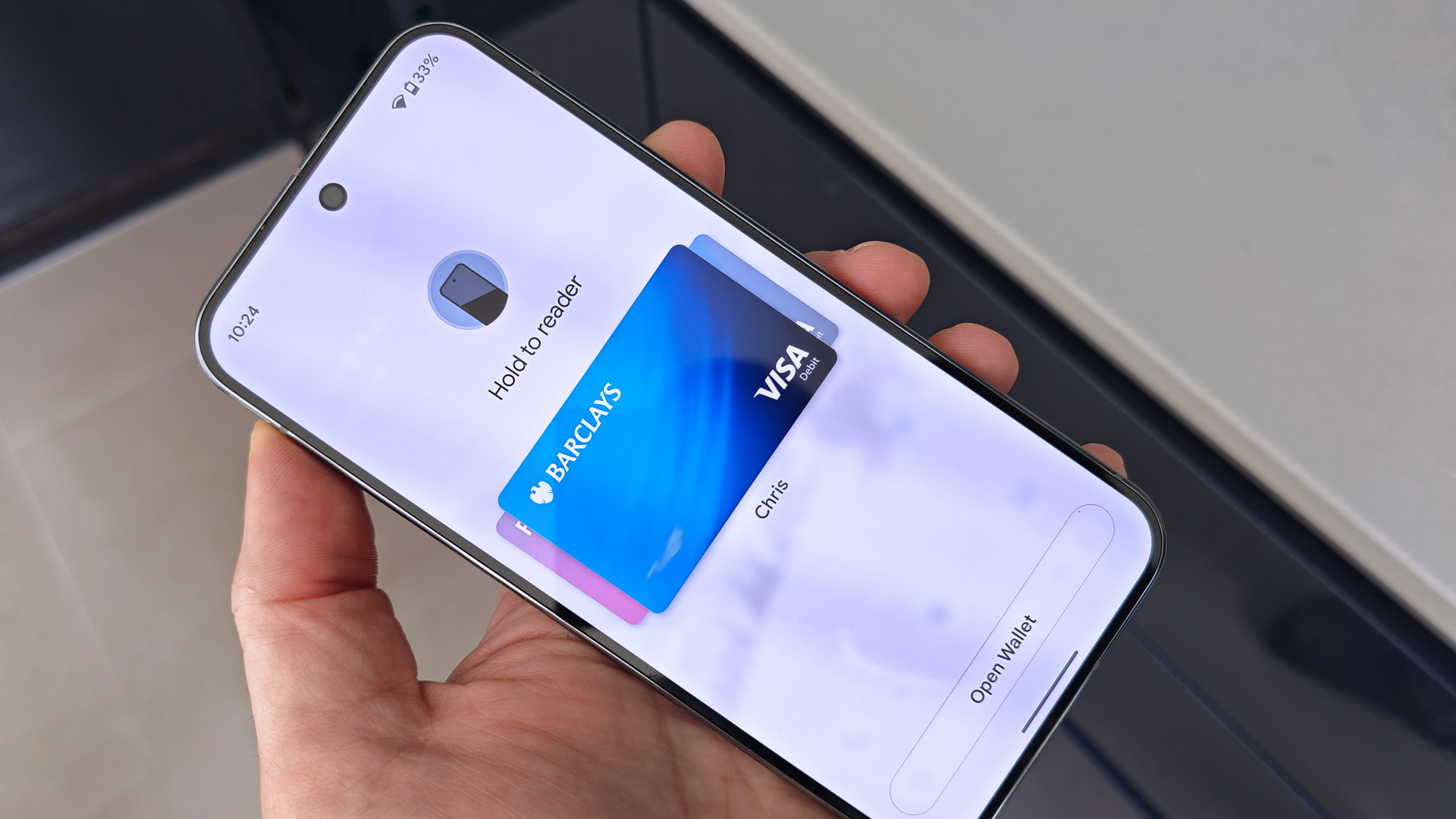
The new feature takes advantage of a change that came with Android 16, which allows you to launch Google Wallet with a double press of the power button, in place of the default camera launch option.
Article continues belowWhen you do that, instead of the Google Wallet app opening, an overlay appears that presents your cards, so you can just tap your phone and go. This overlay blurs out the background behind it, allowing you to swipe through your payment cards. At the bottom of the screen is the option to launch into the full app.

The advantage this has is that you directly go to that one task. Sure, when you open Google Wallet your payment cards are there at the top of the screen by default, but this means that other tickets and cards you might have in Google Wallet aren't all on display – it's just cleaner and better.
The roll-out of this feature appears to be staggered, but I checked my Pixel 9 Pro XL in the UK and found it was already live.
The biggest question is whether you're happy to lose the double-press that you use to launch the camera to get to fast payments instead. It's a tough decision, because as far as I can tell, there's no other way to get to this interface apart from using the shortcut.
Get all the latest news, reviews, deals and buying guides on gorgeous tech, home and active products from the T3 experts
I swear by the quick launch for the camera, however, and this being a Pixel phone, the camera is core to so much that I do with it. Time will tell, but this could change how I use my phone.
At the moment this appears to be aimed at Pixel phones and there's no telling if it will be enabled on other Android devices as a part of Google Wallet. But it also fits into Google's aims for Material 3 Expressive, which is to make actions clearer, reducing clutter so it's more obvious what you're doing.
If you've got a Pixel it's worth checking, as this feature means that using Google Pay no longer feels inferior to Apple Pay on the iPhone.

Chris has been writing about consumer tech for over 15 years. Formerly the Editor-in-Chief of Pocket-lint, he's covered just about every product launched, witnessed the birth of Android, the evolution of 5G, and the drive towards electric cars. You name it and Chris has written about it, driven it or reviewed it. Now working as a freelance technology expert, Chris' experience sees him covering all aspects of smartphones, smart homes and anything else connected. Chris has been published in titles as diverse as Computer Active and Autocar, and regularly appears on BBC News, BBC Radio, Sky, Monocle and Times Radio. He was once even on The Apprentice... but we don't talk about that.
You must confirm your public display name before commenting
Please logout and then login again, you will then be prompted to enter your display name.