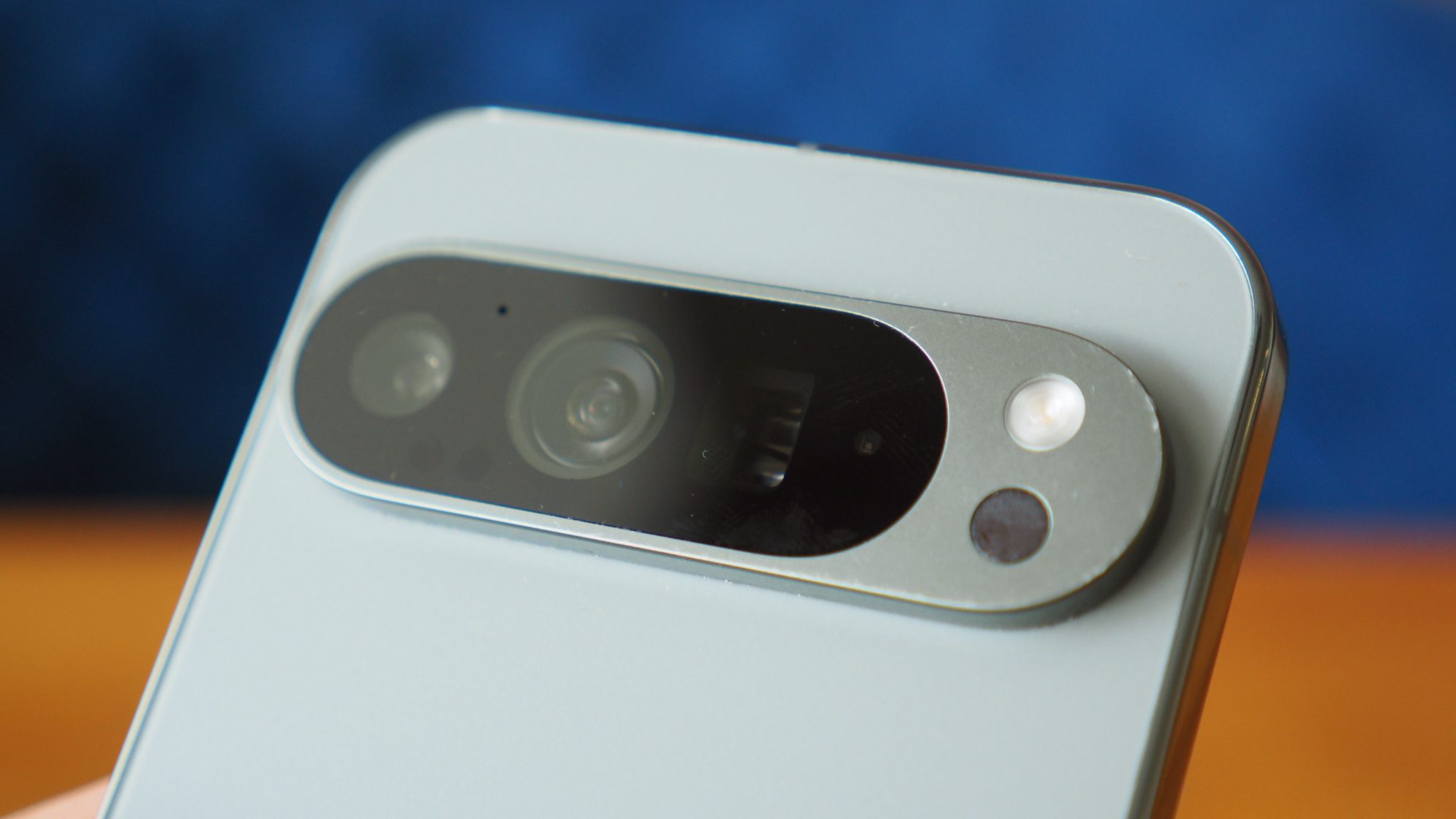
Google's Pixel 10 Pro colours leak and I know exactly which one I'd choose
There's a neat colour palette on offer

Get all the latest news, reviews, deals and buying guides on gorgeous tech, home and active products from the T3 experts
You are now subscribed
Your newsletter sign-up was successful
Quick Summary
The Google Pixel 10 Pro colours have just leaked – and there is one which has really caught my eye.
The Jade is as close as the brand has come to a return of the Hazel hue from the Pixel 7 Pro – which is a personal favourite!
With the launch of the Google Pixel 9 successor expected in the coming weeks, its no surprise that leaks and rumours have begun to spill out from everywhere. The device family has come on leaps and bounds in recent years, and is widely considered to be among the best Android phones on the market right now.
Today, renders which appear to showcase the colour options for the Pro model have appeared online – and it's a tasty offering! Of course, as you'd probably expect, the range is more muted and classy, but that doesn't mean the brand can't still have some fun.
The renders shared by Android Headlines shows off a quartet of colour options, including some classics and a tasty new option. Official names of Obsidian, Porcelain, Moonstone and Jade will be better known to you or I as black, white, blue-grey and a gorgeous pistachio green.
Article continues belowIt's the latter which has really caught my eye. Not only is it bang on trend right now – those pale, pastel green hues are all the rage across fashion and design – it's about as close as the brand has come to a return of the iconic Google Pixel 7 Pro colour scheme.
The Hazel colour variant on that model remains one of the best designed phones I've ever seen, with beautiful curves and a really stylish colour profile. The green is definitely paler on the new Pro variant, but it's paired with gold accents to really bring that whole vibe back.
I'm sure I won't be the only one who enjoys it. I've long been opposed to the brand's decision to move away from the sleek design of those elder models. Still, this is the best I think it has looked so far, and if my position is waning, I'm sure others will be too.
The other colour options also look pretty good, though they follow the more traditional formula for Pro-grade devices. That is a single, fairly inoffensive colour scheme, with accents either a shade lighter or darker.
Get all the latest news, reviews, deals and buying guides on gorgeous tech, home and active products from the T3 experts
It's not exactly the most inspiring colour designs, but it does do a magnificent job of blending in – which is exactly what it's intended to do.

Sam Cross is an award-winning journalist, with nine years of experience in the media industry. His work can be found in publications as diverse as Oracle Time, Metro and Last Word on Sports.
Here at T3, Sam is best known as the brand’s go-to guy for all things luxurious – from exquisite watches to fine fragrances; the latest performance vehicles to intricate audio equipment, and more.
He’s often found travelling around the world to test new launches, complete with high-end backpacks and suitcases in tow. And when he’s not adding to his air miles, Sam can be found in front of a video camera, bringing his distinctive brand of storytelling to T3’s social media channels.
Sam also loves all things analogue including listening to music on vinyl or cassette, and photography on vintage film cameras.
You must confirm your public display name before commenting
Please logout and then login again, you will then be prompted to enter your display name.

