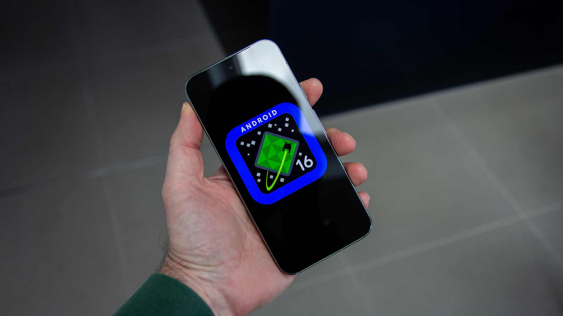
Android 16 gets a great new look, as shown by these leaked images
It's all change for Android with a major redesign incoming


Quick Summary
Design changes for Android have been found in the Android 16 Beta 4.
This signals a change in look for Android, using the Material 3 Expressive design theme.
Android 16 is rumbling along at quite a clip, expected to launch months before Android 15 did.
For starters, Google has announced a special version of The Android Show before Google I/O, while the software itself is currently in Beta 4, the last beta – which you can try yourself if you want to.
But one thing that Android 16 Beta 4 doesn’t currently show you is any of the design changes that might be coming. It’s well known that Google has a new design in the pipeline, which will be known as Material 3 Expressive, but you can't quite access it yourself as yet.
Article continues belowThankfully, the folks over at Android Authority have given us a glimpse of what this redesign could mean for Android phones.
According to the source, these design changes are hidden in Android 14 Beta 4, which means that they aren’t confirmed for the final release – or Google could just be acting coy here, with every intention of giving Android a fresh look and feel.
Most of these changes are around the user interface, with changes to how persistent icons are shown, to fonts, backgrounds and the shapes used across Android, which will have an impact on the day-to-day use of the operating system.
There’s a couple of themes here to explore, with loads more images at the source.
Get all the latest news, reviews, deals and buying guides on gorgeous tech, home and active products from the T3 experts

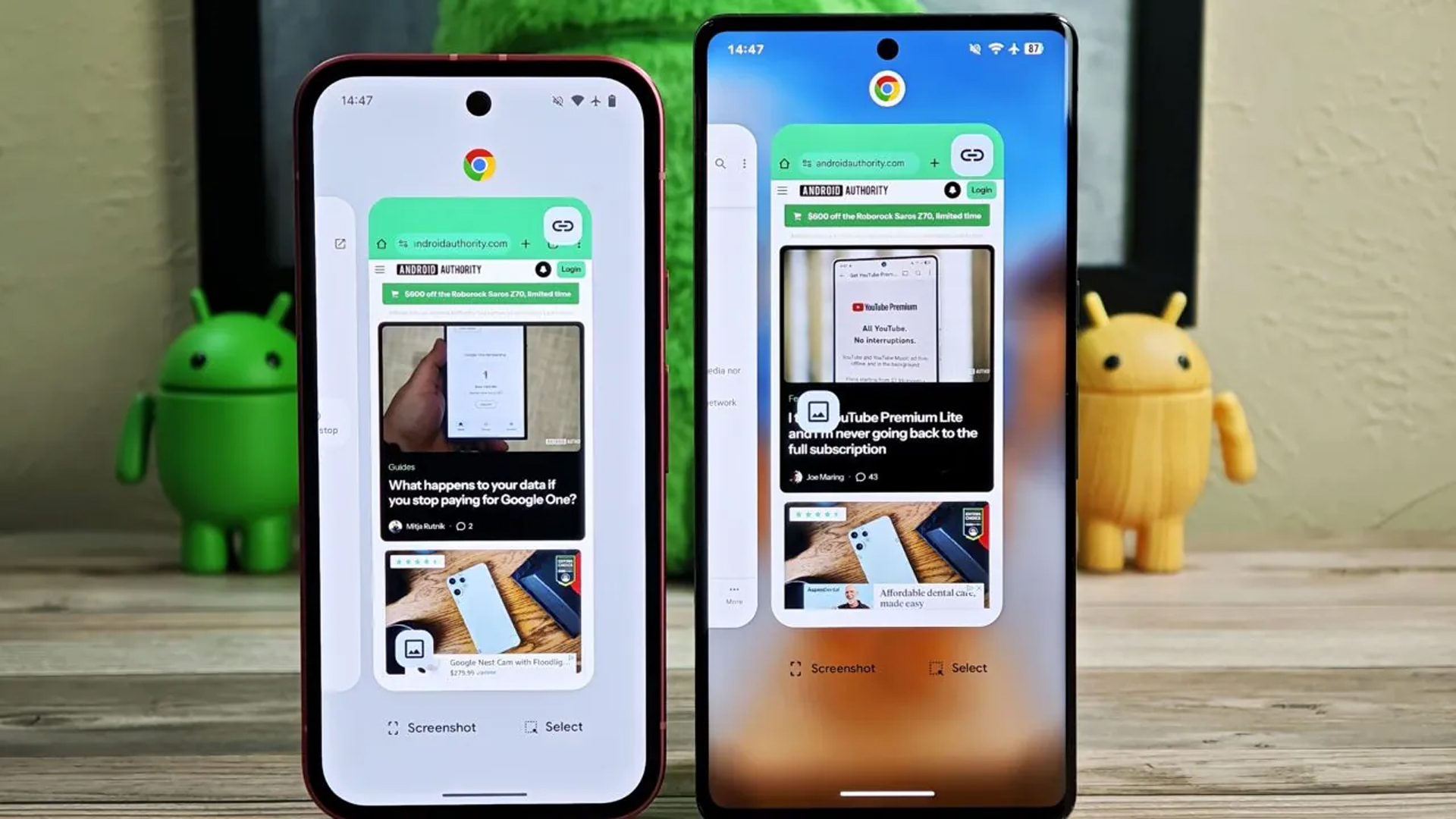
Android 16: background blur
Google seems to be making better use of backgrounds in Material 3 Expressive. Instead of dropping a light or dark shade over the background when you are in the notifications pane or app drawer, we’re seeing the wallpaper coming through.
This isn’t uncommon on Android skins. I’ve been using the Xiaomi 15 for the last week and HyperOS uses this style of background blurring, allowing you to change the intensity of the blur to your preference. I really like it, it gives a little more life to everything happening around your phone.
It looks like it’s coming to the app drawer, notifications pane and recents menu.
Android 16: bolder system icons
The system icons that are shown across the top of the screen are getting bolder. That means that the time will stand out a little better, while the connection details are bolder too. The battery indicator in that top row will also have colour, with the percentage inside it.
Again, some of these things feel like they’re getting picked up from Chinese brand Android skins.
It also looks like there’s going to be a default font change to a taller font (although this could be a user choice) with the lock screen slightly bolder too – and the weather and date dropping under the clock, rather than floating in the top left corner. That brings a little more cohesion to where the information is located.
Android 16: a slightly squarer look
Android has used bubbly icons and sliders for some time, with plenty of use of rounded ends. Things might also be getting a little squarer, most obvious in the volume sliders. Rather than those thick sliders with rounded ends, there will be square ends and thinner bars.
This potentially make better use of space, although at first glance, I’m not totally sold on it. It looks like squarer icons are going to be included in the quick settings menu too.
Android 16: a new settings menu
The settings menu is in line for a refresh too, with colour coming back into it. Not as punchy as in Samsung’s One UI, but a change from the mono presentation of settings in Android 15. There will be arrows to indicate when there’s a menu to click into, which currently isn’t that clear.

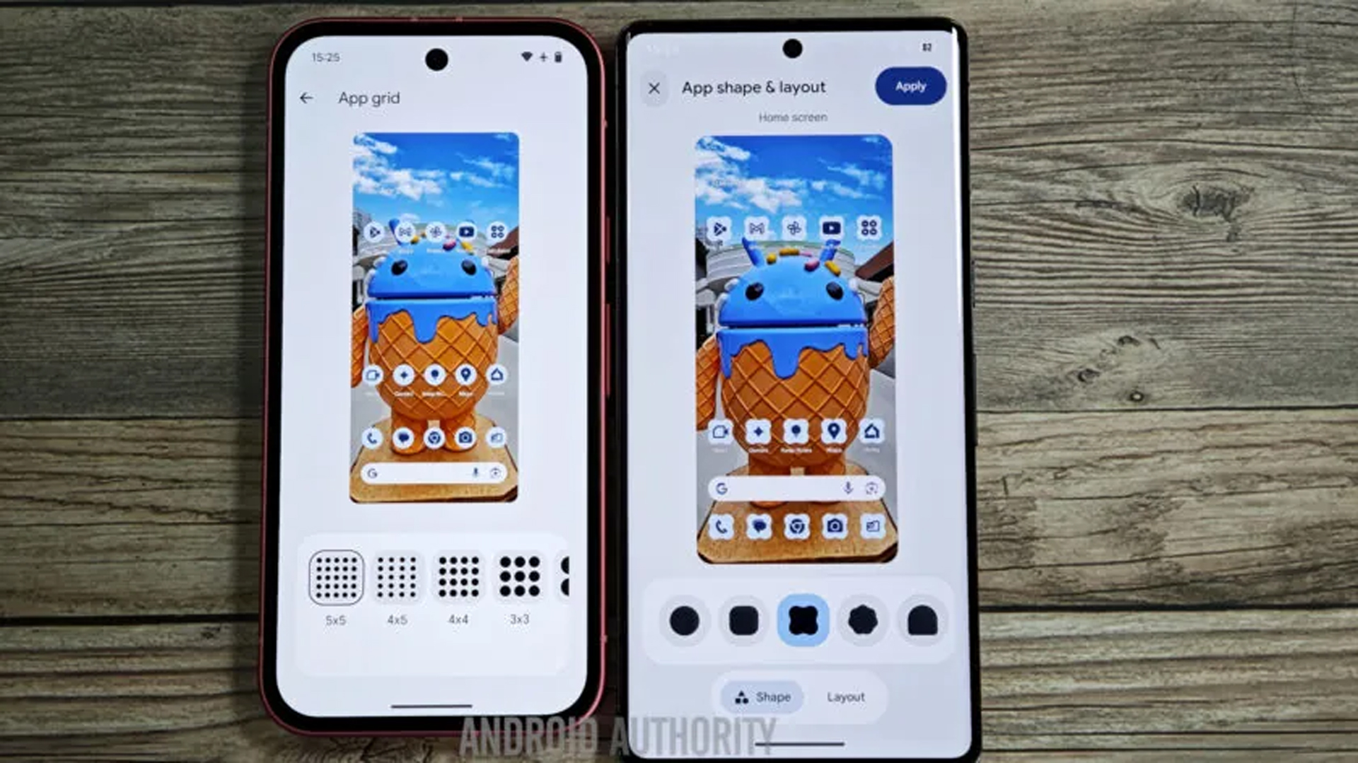
Android 16: app icons that aren’t round
It also looks like new icon shapes will be added to Android 16 too. These will come via the wallpapers app, allowing you to pick a range of shapes that aren’t round.
The Pixel has really pushed round icons, so this is quite a change for Android to offer this, as it’s a big part of third-party launchers and Android skins from other brands.
When can I get Android 16?
As I said, there’s no guarantee that these design changes will all come in Android 16 at launch, but considering the extent of the changes, I wouldn’t be surprised if doesn’t get mentioned at The Android Show in May.
As for Android 16, if you’re a Pixel phone owner, we’re expecting it to be generally available in June 2025. And do make sure you head over to Android Authority if you want to see more pics of the new design.

Chris has been writing about consumer tech for over 15 years. Formerly the Editor-in-Chief of Pocket-lint, he's covered just about every product launched, witnessed the birth of Android, the evolution of 5G, and the drive towards electric cars. You name it and Chris has written about it, driven it or reviewed it. Now working as a freelance technology expert, Chris' experience sees him covering all aspects of smartphones, smart homes and anything else connected. Chris has been published in titles as diverse as Computer Active and Autocar, and regularly appears on BBC News, BBC Radio, Sky, Monocle and Times Radio. He was once even on The Apprentice... but we don't talk about that.
You must confirm your public display name before commenting
Please logout and then login again, you will then be prompted to enter your display name.