WatchOS 10 made me relearn how to use my Apple Watch but it was worth it
I've been using the Public Beta of Apple's latest wearable operating system for a week, and there is no going back now


WatchOS 10 is here! Well, the stable Public Beta version has been available for a week now. As T3's wearable specialist, I took it upon myself to try the new operating system as soon as possible. I downloaded it on my Apple Watch Ultra last Thursday and have been using it since then, much to my delight. Both metaphorically and figuratively, there is no going back now.
WatchOS 10 was heralded as the most significant update to Apple's wearable operating system since the launch of the first Apple Watch in 2015. And while I think that might be a bit of an exaggeration, the new interactions and features of WatchOS 10 are pretty significant. In fact, I had to re-learn some of the more everyday interactions all over again since I updated my watch.

The Apple approach
Even the best Apple Watch wouldn't be worth a thing if the operating system running on the wearable were terrible. There are a lot of exciting smartwatches with innovative sensors entering the market continuously, yet, they often fail to stick around because of the lacklustre operating system and app support. Apple always paid particular attention to their ecosystem, offering people the right features and customisation options.
As someone who has been tutoring user experience design for years, I have been following the evolution of Apple's design principles with great interest. You don't have to be an expert to appreciate it, though. Apple's Human Interface Guidelines (external link) is an exciting read for everyone interested in design and interactions.
What Apple do well and why their products are so popular is because they take away the control from people, showing them only what they need to be shown. One person is clever – a group of people are often dumb. Millions of users are incredibly dumb as a whole and will break the system if they can.
Hence why you can't change batteries in smartphones these days. Putting a crap battery in the best smartphone would turn it into a crap smartphone. If people can cut corners, they will, ruining the user experience as a result. Apple and other companies design their products to ensure this doesn't happen by allowing you to change only a few things and blocking you from the rest.
This enables Apple to create a uniform user experience that transcends any one product. You instantly recognise an Apple device by its looks and behaviour, even if you can't see the device itself. The only way to achieve this is to create a unique design language and apply clever interaction design. And Apple can do that.
Get all the latest news, reviews, deals and buying guides on gorgeous tech, home and active products from the T3 experts

Re-learning to use my Apple Watch in a post-WatchOS 10 world
Knowing all this, it's easy to see why it's a big deal that WatchOS 10 is trying to change things up. A big update means people will need time to adjust to the new interactions and design, and that's not what Apple usually aim for. Thankfully, WatchOS 10 isn't a departure from what we've seen in the previous iterations of the operating system, only an overhaul.
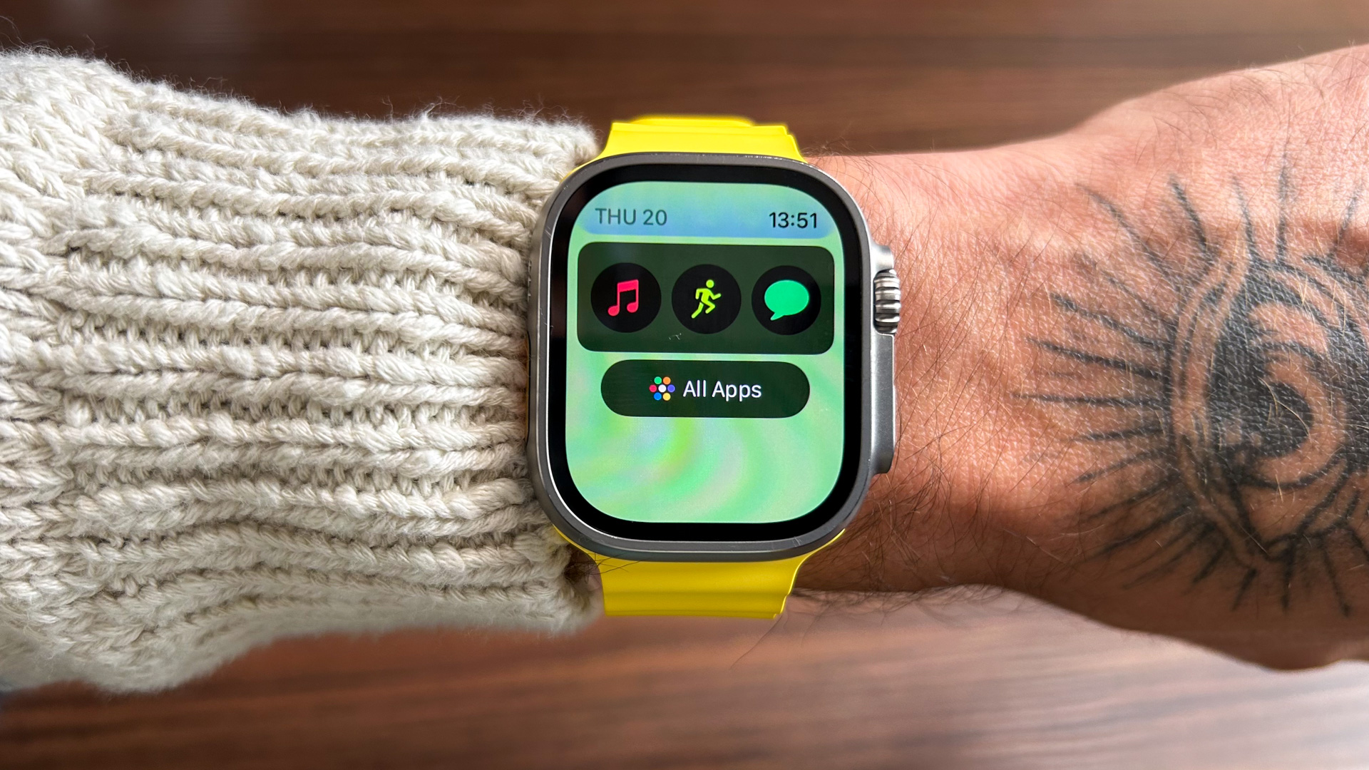
One of the main changes is the remixing of button functions. Pressing the Digital Crown takes you to all your apps, which is how it always used to be. However, scrolling up now shows the new Smart Stack, a collection of widgets that helps you quickly access some of the most often looked-at information, such as news, weather, activity rings, etc. Not a game-changer feature, but it adds another layer to the already extensive feature list of iOS.
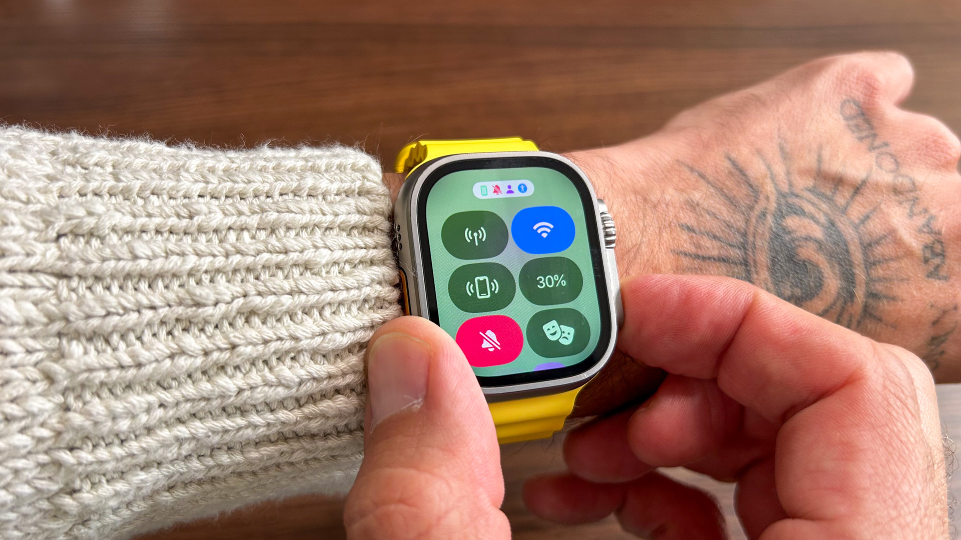
Smart Stack moved into the space where the settings quick links used to live – these have been moved elsewhere. Now, you have to press the action button once to access them. If you think about it, this makes a lot of sense. Previously, the action button was almost redundant. You only really used to access your Wallet (which is still a double press away, as always).
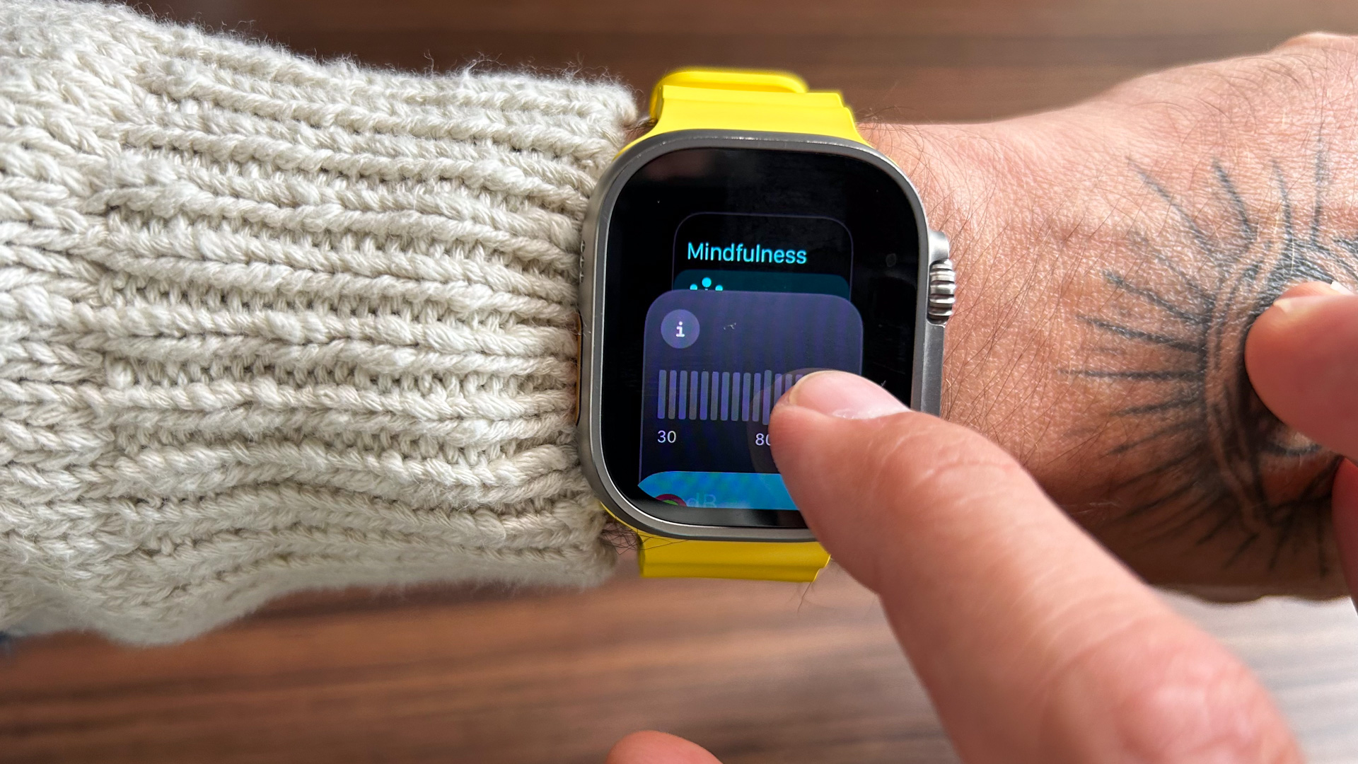
Now single pressing the action button has a function that people would actually want to use more often than once a year. Plus, the same recently used app stack is still available, just elsewhere – behind a double-click of the Digital Crown – where it makes more sense anyway.

I also like that despite the changes, Apple didn't disturb the fundamental interactions on the watch. Nothing happens when you swipe left or right from the watch face, as that's very much a Wear OS/ Android feature. The bubble menu icon is also still present, although switching to the list view is much easier – a nice addition.
Speaking of list view: you can now scroll back to the watch face from here without using any buttons, which is clever. This also works with the bubble icon menu, but it makes more sense when you activate the list view. Essentially, when scrolling back up to the top of the apps, if you keep scrolling up, you get to the bottom of the Smart Stack. Scroll to the top of that; you return to the watch face. This works either way.
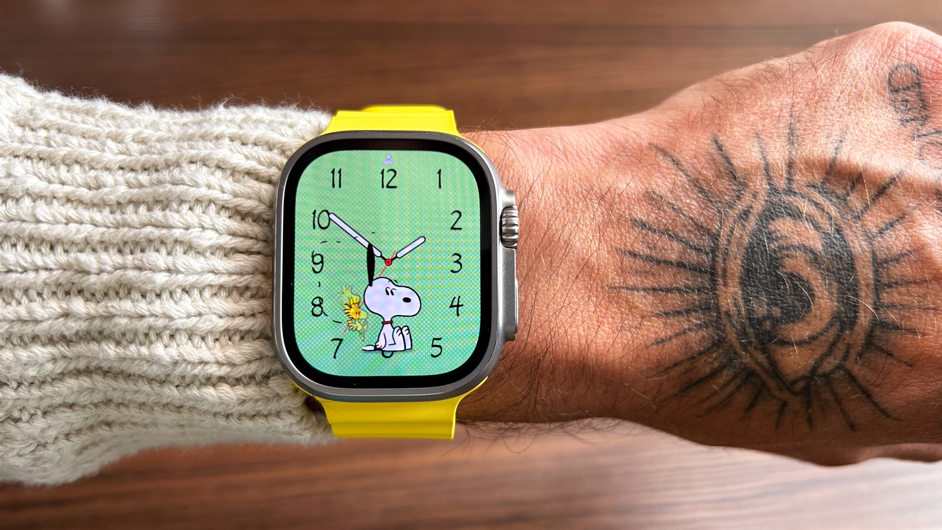
I'm sure there are tons more interactions to discover, and I can't wait to learn those, too. The new design almost makes it feel like you have a brand new watch, regardless if it's the Apple Watch Series 7 you've been using for the last couple of years or the more affordable Apple Watch SE 2. Best of all, it's free! Even if you're not overly interested in the new interactions, you will want to check out WatchOS 10 for the new Snoopy watch face for the Apple Watch. That's the good stuff.

Matt Kollat is a journalist and content creator for T3.com and T3 Magazine, where he works as Active Editor. His areas of expertise include wearables, drones, action cameras, fitness equipment, nutrition and outdoor gear. He joined T3 in 2019.
His work has also appeared on TechRadar and Fit&Well, and he has collaborated with creators such as Garage Gym Reviews. Matt has served as a judge for multiple industry awards, including the ESSNAwards. When he isn’t running, cycling or testing new kit, he’s usually roaming the countryside with a camera or experimenting with new audio and video gear.