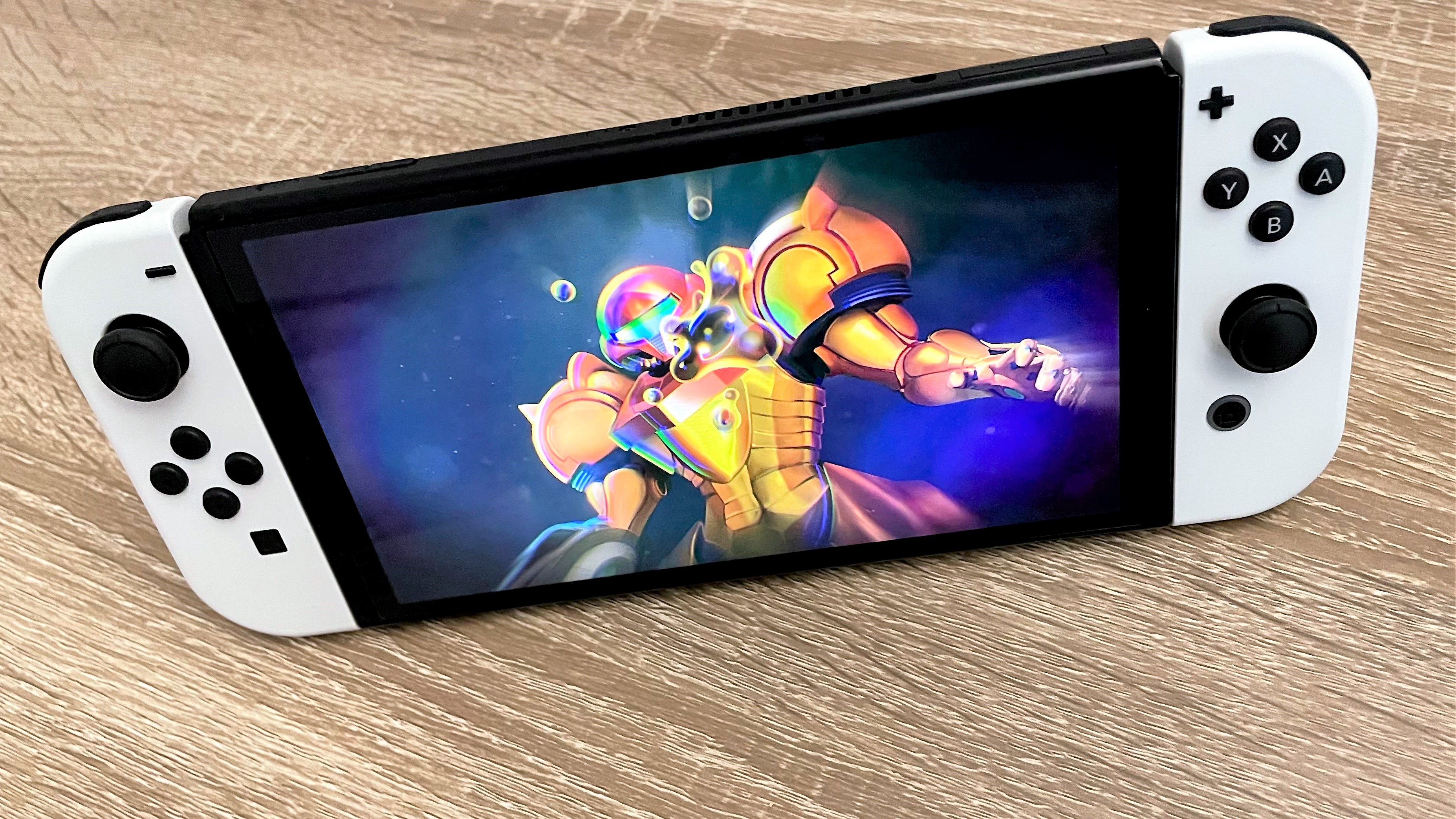
The Nintendo Switch OLED borrowed tech from the Apple Watch to make its screen look so good
The Switch OLED keeps things sharp despite being low resolution thanks to using a more premium pixel type


Get all the latest news, reviews, deals and buying guides on gorgeous tech, home and active products from the T3 experts
You are now subscribed
Your newsletter sign-up was successful
The Switch OLED has really impressed everyone who could actually get one with its larger, lusher display. Our own Switch OLED review called it a "beauty" and said that "it’s bright, colourful and the contrast has improved massively" compared to the original. Which is good, since the screen is the biggest upgrade on the device.
However, there was a risk that because Nintendo didn't upgrade the resolution on the screen at all, switching to OLED might actually have made things look less crisp than on the original. That's because there are two major ways two make an OLED display, and one of them is cheaper and therefore much more popular in today's products, but can lead to pixels looking soft… but thankfully Nintendo chose the other other, rarer, option.
As spotted by The Verge, Nintendo has used a full RGB arrangement for the Switch OLED's pixels, rather than the much more common Pentile system. A full RGB OLED screen uses three 'sub-pixel' LEDs (red, green and blue, of course) for each pixel, keeping things clean and sharp. But Pentile OLED screens actually share some of those sub-pixels across different pixels, making them more efficient and cheaper to produce.
Article continues belowBut this can mean that Pentile displays don't have as clearly defined edges to the pixels as a full RGB display would. On really high-resolution displays, this doesn't matter – the pixels are too small for it to be noticeable. The iPhone 13 and Samsung Galaxy S21 Ultra both have Pentile displays, and they're the best in the world.
But there are times when crisp, clear pixels are vital. On the small screen of the Apple Watch, for example, where the display is trying to mimic a real watch face and show small text and icons, Apple uses a full RGB display to make sure it doesn't look soft in a way that would spoil the experience.
And in the Switch OLED's case, with a such a low resolution of just 1280x720, a Pentile display could have left text and and simpler graphics looking slightly fuzzy, making the OLED screen only half an upgrade really.
It's a small (literally) and nerdy thing to pay attention to, but it's important that Nintendo didn't go the cheaper and easier route here, and used a screen that really shows off how great its games can look even without the 4K resolution and graphics power of the PS5 or Xbox Series X.
Get all the latest news, reviews, deals and buying guides on gorgeous tech, home and active products from the T3 experts

Matt is T3's former AV and Smart Home Editor (UK), master of all things audiovisual, overseeing our TV, speakers and headphones coverage. He also covered smart home products and large appliances, as well as our toys and games articles. He's can explain both what Dolby Vision IQ is and why the Lego you're building doesn't fit together the way the instructions say, so is truly invaluable. Matt has worked for tech publications for over 10 years, in print and online, including running T3's print magazine and launching its most recent redesign. He's also contributed to a huge number of tech and gaming titles over the years. Say hello if you see him roaming the halls at CES, IFA or Toy Fair. Matt now works for our sister title TechRadar.