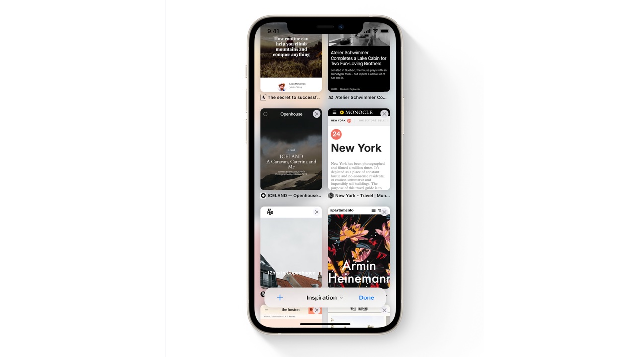
The new Safari on iPhone and iPad is a problem, but it’s not too late to fix it
Lots of people think the new Safari sucks in iOS 15 and iPadOS. They might be right, but there's still time to sort it


Get all the latest news, reviews, deals and buying guides on gorgeous tech, home and active products from the T3 experts
You are now subscribed
Your newsletter sign-up was successful
Apple, like any tech firm, doesn’t always get it right. Sometimes it gives you a U2 album you really don’t want, or tells you you’re holding your phone wrong, or makes a mouse you can’t charge while using it. And sometimes it updates an app and, well, ruins it. Say hello to Safari in iOS 15 and to a lesser extent, in macOS Monterey.
There’s lots of good stuff in the new Safari, including excellent privacy protection and some useful new features. But the interface is really divisive already.
It’s been really interesting to see people’s responses to the radically different user interface Apple has introduced for Safari in iOS 15. A lot of people really, really hate it; a few love it; and quite a few responses seem awfully like Stockholm syndrome, with people who clearly hate the interface and find it more difficult to get stuff done gritting their teeth and saying “it takes a bit of getting used to!” in much the same way adults used to trick me into jumping into freezing Scottish seas that probably still had icebergs in mid-summer.
Article continues belowThe good news is that this is an early beta, so there’s plenty of time for Apple to make Safari better – and plenty of people are urging Apple to do just that. People's feedback ranges in usefulness, of course, from those who are just railing against to those who are able to say constructively what Apple might change to make things better. It's certainly possible for Apple to change course.
So why are people unhappy, and what are we hoping will be improved?
What's wrong with Safari in iOS 15?
For many people, Apple is making changes unnecessarily and they’re quick to quote Steve Jobs: “The design is not just what it looks like and feels like. The design is how it works.” And in many ways the new Safari goes against that. The drive to declutter the toolbar and make more screen space means that previous features such as reloading or switching into Reading Mode require two taps rather than one. Tabs become hard to identify very quickly and on iPhone having the tab/search/address bar at the bottom is inconsistent with other Apple devices and easy to mis-hit.
Safari’s colour matching is also jarring: it tries to copy the main colour of the underlying page, so switching between tabs can be pretty jarring, especially in low light.
Get all the latest news, reviews, deals and buying guides on gorgeous tech, home and active products from the T3 experts
Not everyone agrees, I know – people have been quick to say that that for them, Safari looked and felt better. But as someone who’s constantly switching between Mac, iPhone and iPad, and whose Share button is in almost constant use, it does feel like this Safari is a small step backwards.
The iPhone tab bar is more reachable, but beyond that what problem does the new interface really solve if it makes everything else worse? The features I use most are harder to access, the interface gives me sore eyes, it’s harder to navigate around and it’s really easy to swipe in the slightly wrong place and get a completely different thing from what you set out to get.
It looks nice, for sure, but… well, you know what Steve Jobs would say.

Writer, musician and broadcaster Carrie Marshall has been covering technology since 1998 and is particularly interested in how tech can help us live our best lives. Her CV is a who’s who of magazines, newspapers, websites and radio programmes ranging from T3, Techradar and MacFormat to the BBC, Sunday Post and People’s Friend. Carrie has written more than a dozen books, ghost-wrote two more and co-wrote seven more books and a Radio 2 documentary series; her memoir, Carrie Kills A Man, was shortlisted for the British Book Awards. When she’s not scribbling, Carrie is the singer in Glaswegian rock band Unquiet Mind (unquietmindmusic).