TomTom Start 60
Does this budget satnav live up or down to its low price?
-
+
Simple
-
+
no frills UI
-
+
Does its one job well
-
+
Search intuitive and logical
-
-
No traffic alerts
-
-
No Bluetooth/app integration
-
-
Poor touchscreen
Why you can trust T3 Our expert reviewers spend hours testing and comparing products and services so you can choose the best for you. Find out more about how we test.
TomTom's Start 60 is your entry level satnav, but at a penny off £140 it's still a fairly beefy investment, and just a tenner more than an iPod Nano, for instance.
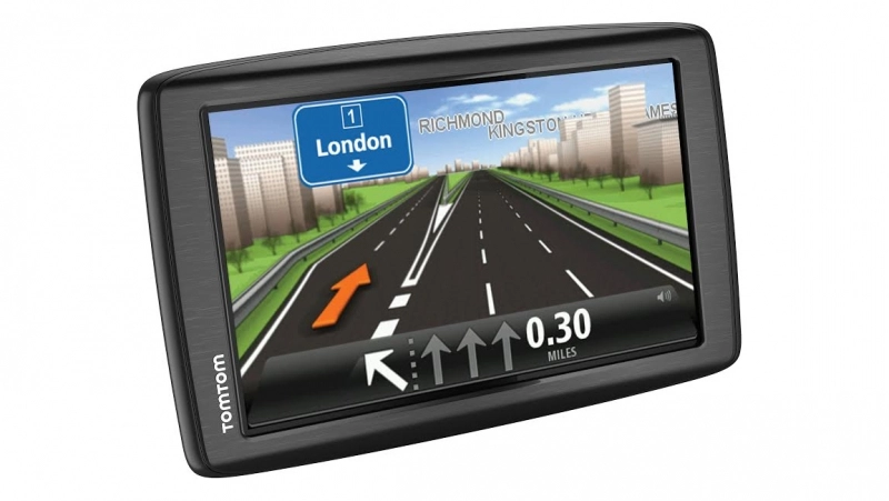
But invest in brand TomTom and you get four map updates a year covering the whole of Europe for the lifetime of the product (which should be enough for even the most anxious cartographer). The unit is a 6-inch, 800 x 480 px, 16:9 resistive screen touch screen clad in finest black plastic.
TomTom Start 60: Features
As this is an entry level system, it's a thing of basics. Even the product flogging page on TomTom's website seems to struggle to find features to beat its chest about. You get unified search, which throws together addresses with points of interest on one screen. Advanced lane guidance gets you set in the right lane nice and early, to avoid kamikaze last-second lane surfing on the M25 and quick search fills in your queries a bit like a Google search, offering up handy suggestions.
Fire it up and the menu's a stripped down affair, offering five icons covering Search, Current Route, My Places, My Routes and Parking. The quick search starts throwing up options when you hit the third character of your destination and splits results into addresses on the left, and points of interest on the right and therefore has one, unified screen when others split this, which makes a lot of sense. It's a breeze to find destinations, add to favourites – which you can personalise into “Nan's house”, “Definitely not a person I'm having an affair with” etc – and you can live mark locations which will appear here later. Clever. Similarly, you can save routes in My Routes if you've modified a journey to avoid tolls or otherwise customised your navigation.
TomTom Start 60: Performance
The charger is a USB plug, so you can run the unit in your car and update it at home via your PC with just one cable, plus it adds a spare USB charger to your car when you don't require navigation. Smart and handy.
The windscreen attachment is a solid-feeling turn and click affair, making the foot easier to pull off than the usual suction cup. But the micro USB plug is awkwardly set to the right-hand-side of the unit. Great for our colourful-jeaned European chums, but for us Brits, this means it's more likely to trail in an unsightly manner over your car's centre console, and get in the way of the stereo dials and such.
It's got the same 6-inch screen as the Garmin, but weirdly, because of the rounded edges, it somehow feels smaller. The rounded TomTom just feels somehow less premium than the Garmin's sharp edged, industrial design.
Get all the latest news, reviews, deals and buying guides on gorgeous tech, home and active products from the T3 experts
While driving, the screen's split into two sections: classic satnav view, which takes up the left-hand-side real estate –car arrow, map, streets – and a route counter which covers the right-hand third. This tracks your journey on a simple vertical axis, flagging up things of interest like petrol stations, parking and speed cameras. If you touch a petrol station icon, the TomTom 60 will add that destination into your route. It also displays current time, distance to destination, time to destination and estimated time of arrival, all at a glance - and it does all this well. What could be cluttered and confusing is neither. Left hand bit for navigation. Right hand bit for info. Simple.
There's a choice of 14 voice accents, from English to Irish, to American, Kiwi and Aussie. We chose the calming tones of an Irish lady (possibly) called Naoimh and we found the commands to be timely, well spaced on the right side of annoyingly frequent.
TomTom Start 60: Verdict
This widescreen unit does navigation very well, with information organised succinctly, and just the right number of notifications to help you navigate. But that's all it does. The maps are clear, the voice directions are so perfect they become invisible and the UI is intuitive and simple. But with a raft of free navigation apps now available on iOS and Android, companies like TomTom need to work harder than ever to keep their products relevant, to offer extra services, do more, be delightful. Essentially, this does what a smartphone app does, only with no live traffic aid, a much worse screen, and a price tag of £140, making it rather difficult to recommend.