I have one major concern with the newly face-lifted Tesla Model 3
Tesla’s bid to simplify the interior might have gone too far this time

Get all the latest news, reviews, deals and buying guides on gorgeous tech, home and active products from the T3 experts
You are now subscribed
Your newsletter sign-up was successful
Tesla doesn't usually make an appearance at motor shows, where it is forced to share the spotlight with competing brands all gathered under the bright lights of a convention centre. But for IAA Munich (essentially the Munich motor show), Tesla made an exception.
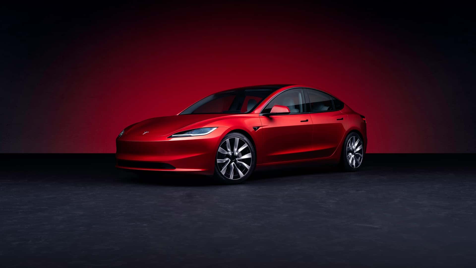
On a small stand, tucked away in a hall mostly filled with automotive parts suppliers and technology firms, Tesla showed off an example of its newly updated Model 3. Known internally as Highland, the Model 3’s first major facelift since it launched back in 2017 is a big deal.
Instead of mere software updates, of which Tesla is arguably king, this is a proper facelift, complete with a new front bumper and headlight design, and an updated interior too.
The biggest feature inside is a second touch screen display, mounted between the front seats and intended for rear passengers to adjust their own air conditioning vents, control music, and even move the front passenger seat forwards. That’s the sort of thing you tend to see on a luxury German barge like the BMW i7, but anyone riding in a Model 3 taxi will be thankful for the extra legroom the touchscreen can orchestrate.
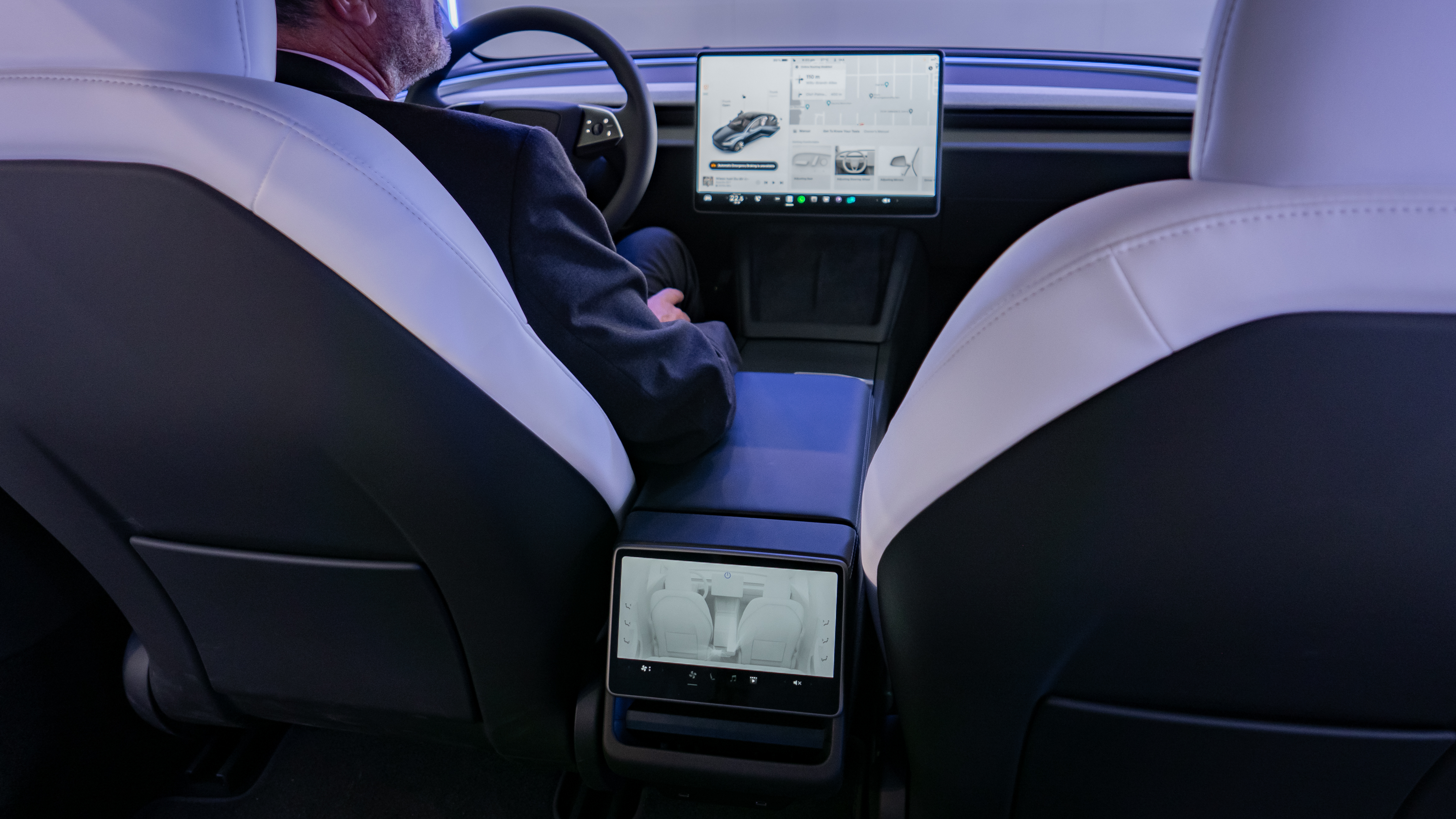
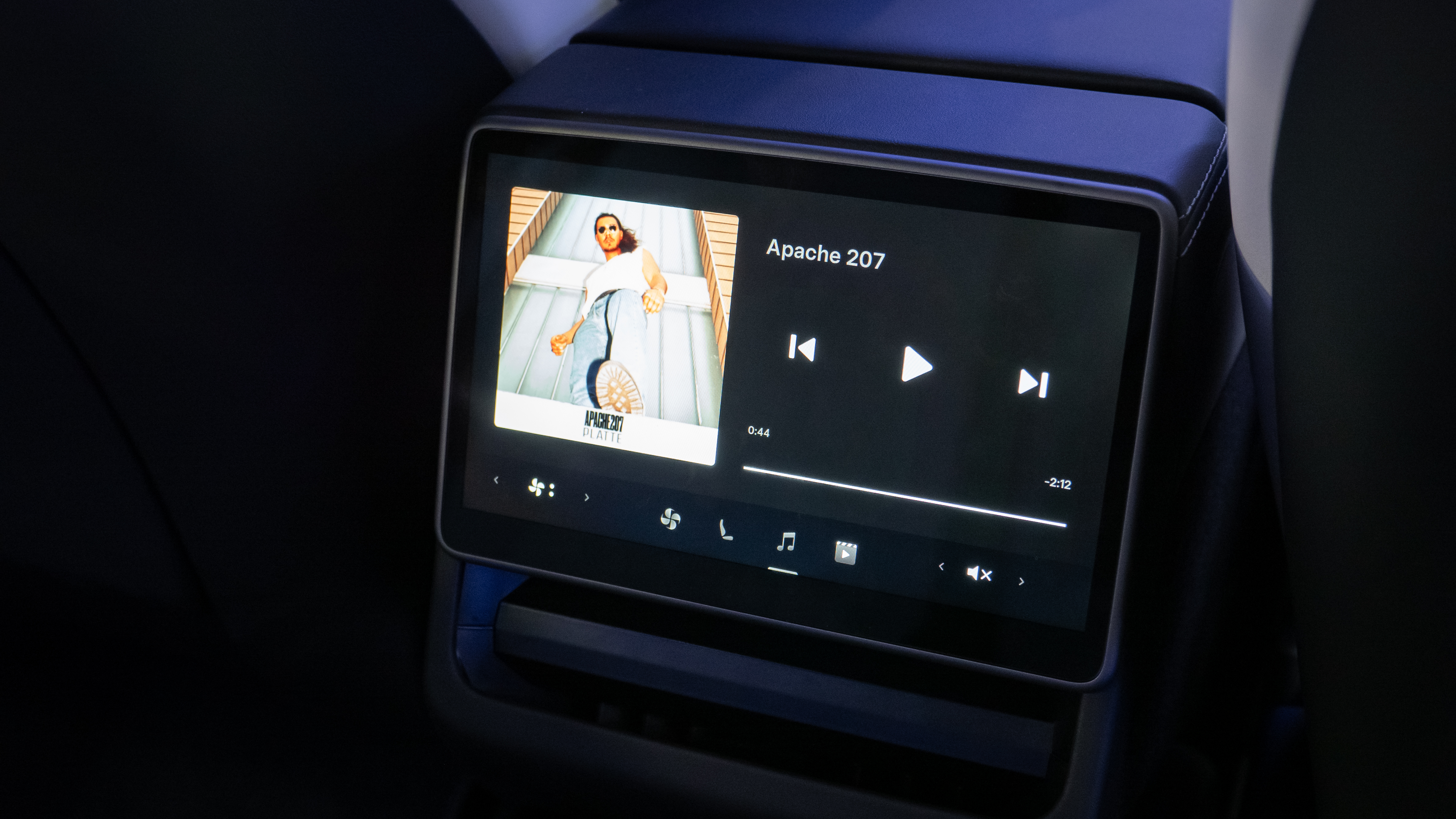
More interesting is how the screen has access to Netflix and YouTube. This seems great, and children will likely be thrilled at the prospect of watching video on the go. But the screen is only small – roughly the size of an iPad Mini – and mounted low down, almost at ankle level. I’m really not sure I’d be able to watch a single YouTube video on there without motion sickness setting in, let alone embark on an hours-long Netflix binge.
I can imagine the screen being handy for glancing at live sport on a long journey. Otherwise it feels like a nifty way to adjust the air con or hijack the music playlist, but little more.
Moving to the front of the new Model 3, and the central storage area has been improved. This always felt cheap and flimsy on the original 3, but now slides open and closed with the premium damping you’d normally find in a luxury German saloon. It instantly makes the Model 3 feel more premium.
Get all the latest news, reviews, deals and buying guides on gorgeous tech, home and active products from the T3 experts
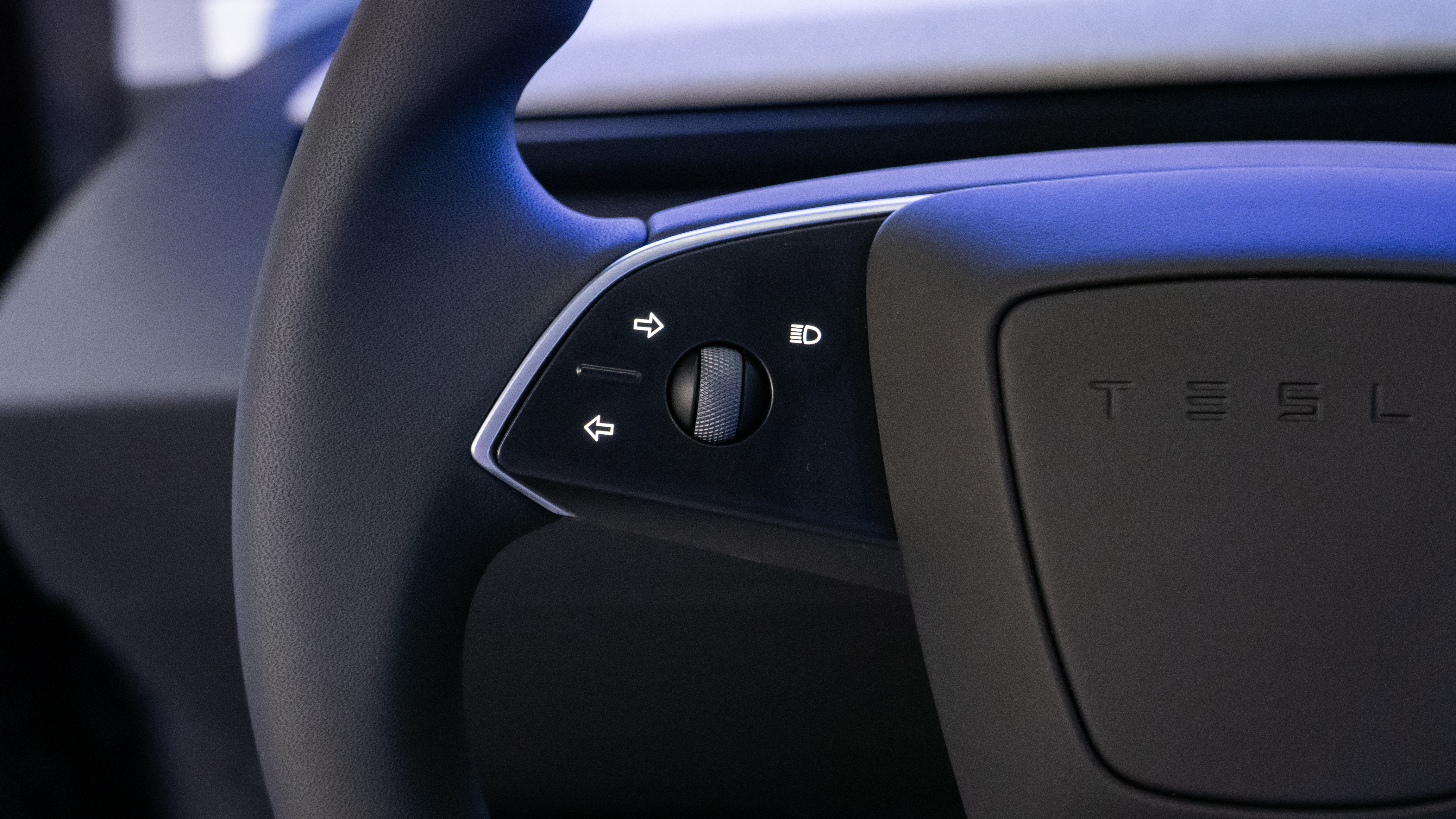
But then there’s the steering wheel. Tesla has thankfully avoided fitting the aeroplane-style yoke that’s an option on the Model S, but it has mimicked the larger car in other ways. There are no stalks at all and no physical gear selector either. Instead, the indicators are controlled by pressing a pair of haptic buttons with your left thumb. The haptic feedback is actually very good, but moving the indicators from a conventional, universally-understood stalk to buttons on the wheel is frankly absurd.
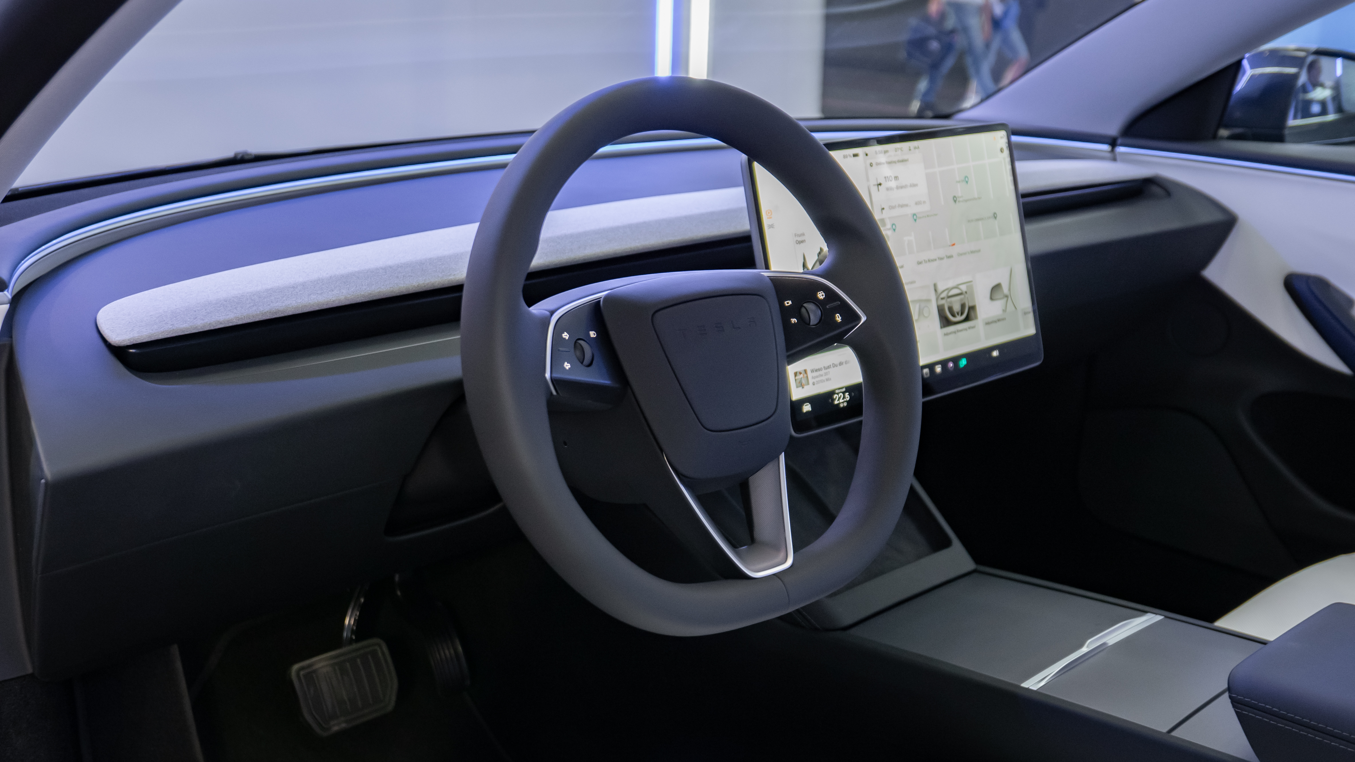
On approach to a roundabout there’s a good chance the wheel will be upside down, moving the buttons to the right and also inverting them. And since they are mounted one atop the other, instead of next to each other, they’ll be upside down and pointing in the opposite direction to where you’re intending to indicate. This might work fine on the grid-style road networks of US cities, but I can see it being incredibly frustrating on the more complex roads of the UK and Europe.
In fairness, Tesla isn’t alone here. Ferrari caused controversy when it removed the stalks and added indicator, light and wiper buttons to the steering wheel of the 458 Italia in 2009. Today’s Ferraris also lack stalks, but the buttons have evolved over the years and can now be operated either with a press of a thumb or a pull of an index finger from behind the wheel. Also, crucially, the indicator buttons are on either side of the wheel, rather than stacked together on one side.
Sticking with the Modena region of northern Italy, and Lamborghini is another source of indicator frustration. I recently drove the Huracan Sterrato and, glorious V10 engine and cartoon styling notwithstanding, was left frustrated on every journey by the indicators, which are controlled by a toggle switch under the left thumb. The vagueness of its movement might even be worse than the haptic click of the Tesla Model 3, but a flamboyant Italian supercar can get away with this sort of thing. An EV intended for everyone to use every day simply cannot.
Regrettably, there’s more. The new Model 3’s gear selector is now on the touchscreen. I can’t speak for the responsiveness of this, as I’m yet to drive the car, but I’d rather Tesla had stuck with the previous setup. What’s more, because there's always a risk of the touchscreen or infotainment system failing, Tesla has fitted a set of backup gear select buttons on the interior roof, by the central mirror.
This surely undoes the potential argument that removing the stalks saves Tesla money, because it has had to develop, produce and install a set of backup buttons where there weren't any before.
Don't get me wrong; I'm excited to drive the new Model 3. I think it looks good and it will likely deliver fantastic performance and range. But I fear that changes have been made for the mere sake of it, rather in a bid to make the car easier or more intuitive to drive. I hope to be proved wrong, but for now am inclined to suggest Tesla stop trying to reinvent the wheel.

Alistair is a freelance automotive and technology journalist. He has bylines on esteemed sites such as the BBC, Forbes, TechRadar, and of best of all, T3, where he covers topics ranging from classic cars and men's lifestyle, to smart home technology, phones, electric cars, autonomy, Swiss watches, and much more besides. He is an experienced journalist, writing news, features, interviews and product reviews. If that didn't make him busy enough, he is also the co-host of the AutoChat podcast.